Sylvia and I made this visualization as our final project in the fall 2012 Visualization course at Peking University. It is an experimental visualization of a Weibo dataset, including 1,425 Weibo users and 1,930 Weibo statuses (like tweets) in 4 topics.
We aim to reveal the time-wise evolution of popular topics. Specifically:
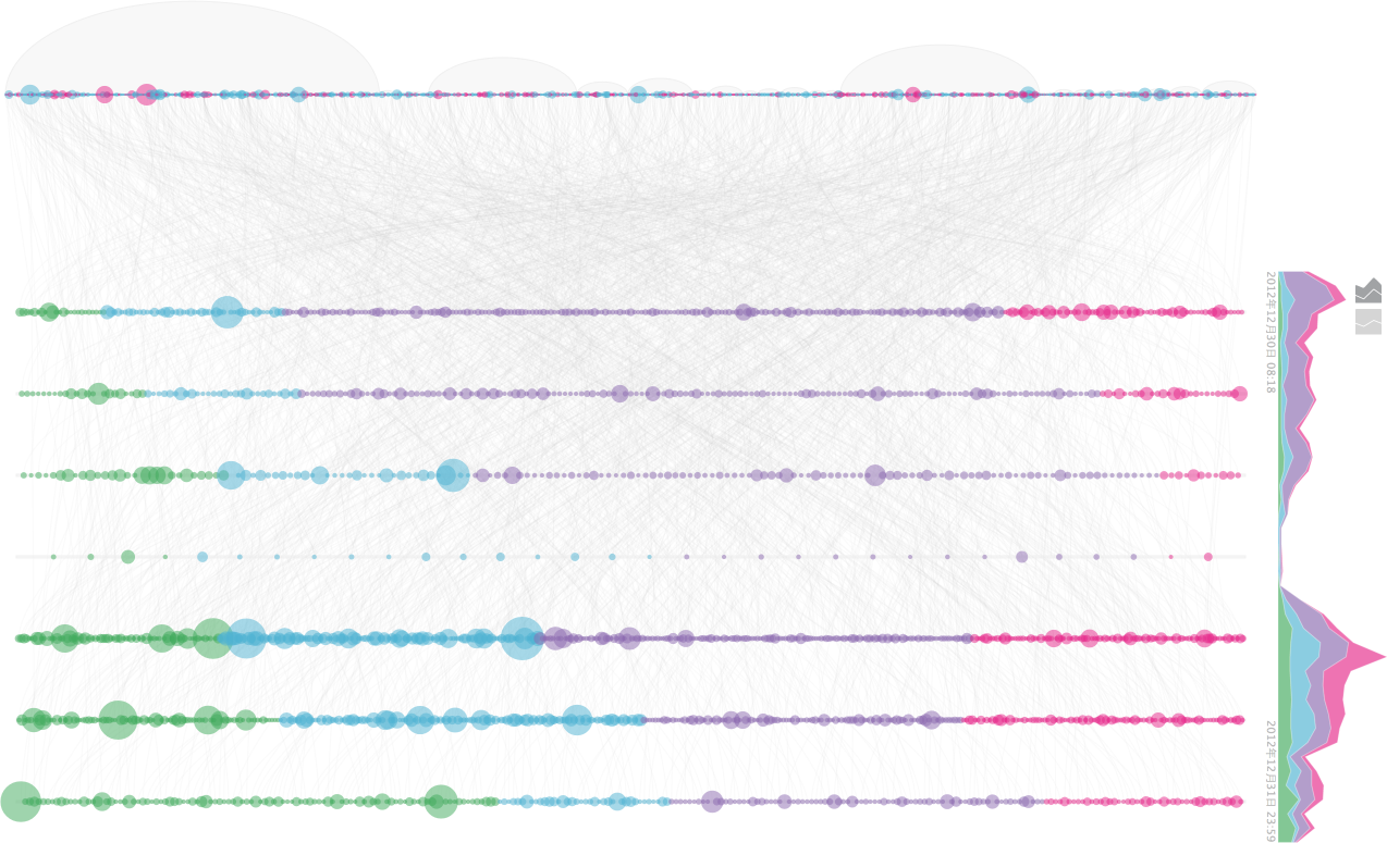
There are three views in this visualization: status chart, topic chart, and user chart.
The main view is the 7-layer bubble chart of statuses. Each bubble corresponds to a Weibo status. The size reflects its influence (i.e. number of reposts and comments), while the color maps to its topic. To simplify the visualization, we grouped statuses into 7 layers based on the time they are posted. If you are interested in the time-wise distributed of a layer, you can expand the layer by clicking on it.
On the right side is a stacked area chart to demonstrate a big picture of topic evolution, in either absolute value or in percentage. Clicking on a topic layer in the stack will filter Weibo statuses on the left.
The bubble chart at the top represents users. Each bubble is a user, grouped by location. The size represents his / her influence (i.e. number of followers), and the color represents gender. Each status bubble is linked to its author. Users can be selected by cliking on a single bubble or on a location ellipse.